Skip to content

Introduction
Graphs are powerful tools for visualizing data, allowing you to gain insights and identify patterns that may not be immediately apparent from raw numbers. In this article, we will explore different types of graphs and how each type is uniquely suited to represent specific kinds of data.
The types of graphs covered in this article include:
- Bar Graphs
- Line Graphs
- Pie Charts
- Scatter Plots
- Histograms
- Other Types of Graphs
Each type plays a crucial role in visualizing data. Whether it’s comparing categories, showing trends over time, or representing part-to-whole relationships, it’s important to choose the right type of graph for effective data analysis and communication. Selecting the appropriate graph ensures that your audience can easily interpret information, leading to better decision-making and understanding of the underlying data.
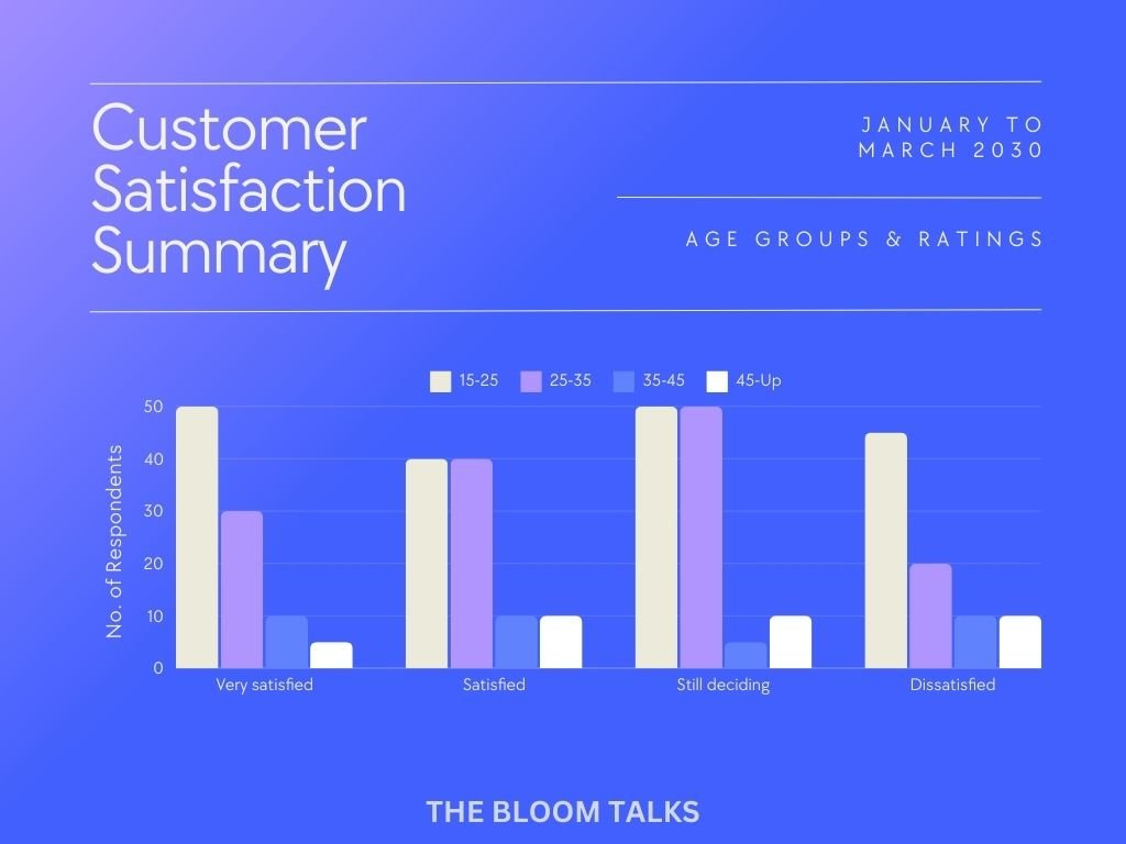
1. Bar Graphs
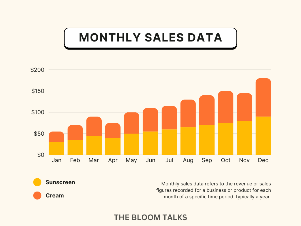
Definition and Purpose of Bar Graphs
A bar graph is a visual representation of data that uses bars of varying lengths to compare categories or values. It is an effective tool for data visualization, allowing you to quickly interpret and understand the significance of the data being presented.
How to Create a Bar Graph
Creating a bar graph is a straightforward process.
- Identify the Categories: Determine the categories you want to compare and gather relevant data.
- Choose the Correct Scale: Select a suitable scale for your graph. Ensure that it adequately represents the data range without excessive empty space.
- Draw Bars: Draw bars for each category. Make sure they are equally spaced and of appropriate width.
- Label Your Axes: Label both the x-axis and y-axis with clear and concise titles.
- Add Title: Provide your bar graph with an informative title that summarizes its purpose.
Examples and Use Cases
- Comparing Sales Figures: Bar graphs can be used to compare sales figures for different products over a specific period.
- Analyzing Survey Results: When analyzing survey responses, bar graphs can effectively illustrate the distribution of responses for each question.
- Tracking Expenses: Bar graphs are useful for comparing monthly expenses in different categories such as food, transportation, and leisure activities.
Advantages and Limitations of Bar Graphs
Advantages
- Clarity: Bar graphs provide a clear visual representation of categorical data, making comparisons easy.
- Simplicity: They are easy to understand and create, making them accessible for all levels of data analysis.
Limitations
- Complex Data: Bar graphs are less effective when dealing with complex relationships between multiple variables.
- Limited Detail: They may not be ideal for representing detailed continuous data.
In summary, bar graphs are invaluable tools for visually representing categorical data in a straightforward, accessible manner. Understanding their purpose, creation process, use cases, advantages, and limitations will help you effectively utilize bar graphs in your data analysis endeavors.
2. Line Graphs
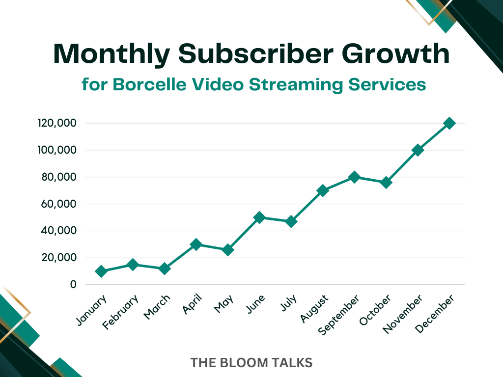
Definition and Purpose of Line Graphs
A line graph, also known as a line chart, is a graphical representation of data in which information is visualized using a series of data points called ‘markers.’ These markers are connected by straight lines. Line graphs are commonly used to display data, showing how one variable changes in response to another. This makes them ideal for illustrating trends and patterns over time.
How to Create a Line Graph
Creating a line graph is a straightforward process that can be done using various software tools such as Microsoft Excel, Google Sheets, or specialized data visualization platforms like Tableau or Power BI. Here’s a basic guide to creating a line graph.
- Data Preparation: Organize your dataset with two sets of related variables, for example, time and corresponding values.
- Select Data: Choose the specific data points you want to include in the line graph.
- Insert Chart: In the chosen software tool, select the option to create a line graph or chart.
- Customization: Customize the appearance of the graph by labeling axes, adding titles, and adjusting colors if necessary.
- Finalize: Review the created line graph to ensure it accurately represents your data.
Examples and Use Cases
- Stock Market Trends: Visualizing stock prices over time to identify patterns and make informed investment decisions.
- Temperature Fluctuations: Showing temperature variations throughout different seasons to analyze climate trends.
- Population Growth: Illustrating changes in population size over decades, important for demographic studies.
- Making Line Graphs: Comprehensive guide on creating line graphs with tips and best practices.
Advantages and Limitations
Advantages
- Clear Visualization: Line graphs provide a clear visual representation of trends and patterns.
- Comparative Analysis: Easily compare multiple sets of data on the same graph, allowing for insightful analysis.
Limitations
- Limited Variables: Line graphs are best suited for representing one or two variables. Adding more may lead to cluttered visuals.
- Data Interpretation: Misinterpretation can occur if not properly labeled or if outliers are not addressed.
By leveraging line graphs effectively, you can gain insights into various trends and patterns within your dataset.
3. Pie Charts

Definition and Purpose of Pie Charts
Pie charts are a popular visualization tool used to represent numerical proportions or percentage distributions. They are visually appealing and easy to understand. They are effective for showcasing the relationship of parts to a whole, making it easier to comprehend the relative sizes of different categories within a dataset.
How to Create a Pie Chart with Step-by-Step Instructions
Creating a pie chart can be easily accomplished using popular spreadsheet software like Microsoft Excel or Google Sheets. Here are the basic steps to create a pie chart in Google Sheets.
- Enter your categorical data into the spreadsheet.
- Select the data range that you want to include in the pie chart.
- Click on “Insert” in the menu, then choose “Chart.”
- In the Chart editor, select “Pie chart” from the Chart type dropdown menu.
- Customize the appearance, labels, and colors as per your preference.
- Click “Insert” to add the pie chart to your spreadsheet.
For those using Tableau for data visualization, creating a pie chart involves dragging and dropping dimensions and measures onto shelves and selecting “Pie” as the chart type.
Examples and Use Cases
- Marketing Analysis: Pie charts can effectively display market share percentages for different products or services.
- Budget Allocation: They can visually represent how funds are distributed across various expense categories.
- Demographic Distribution: Pie charts are useful for representing demographic proportions such as age groups or gender distribution.
Advantages and Limitations
Advantages
- Simplicity: Easily understandable for audiences without specialized knowledge in data analysis.
- Visual Appeal: The circular shape and color-coded segments make them visually appealing.
- Part-to-Whole Comparison: Clearly illustrates how each category contributes to the total value.
Limitations
- Data Overload: Not suitable for displaying too many categories; it may become cluttered and difficult to interpret.
- Limited Comparisons: It’s challenging to compare multiple pie charts directly.
- Misinterpretation: Relative size perception can be misleading if not accurately labeled or if there are too many small slices.
4. Scatter Plots

A scatter plot is a type of graph used to display the relationship between two variables. It is particularly useful for comparing variables and conducting correlation analysis. In a scatter plot, each data point is represented by a dot. The position of the dot on the graph corresponds to the values of the two variables being compared.
How to Create a Scatter Plot
To create a scatter plot, follow these step-by-step instructions:
- Choose two variables you want to compare. For example, you might want to analyze the relationship between hours studied and exam scores.
- On a coordinate grid, place one variable on the x-axis (horizontal) and the other on the y-axis (vertical). For our example, you would place hours studied on the x-axis and exam scores on the y-axis.
- Plot each data point on the graph. Place a dot at the intersection of the x and y values. Repeat this for all data points.
Examples and Use Cases
Social Sciences
Scatter plots can be used to examine the relationship between variables such as income and education level, or crime rate and poverty rate.
Medicine
Scatter plots are useful for studying correlations between variables like blood pressure and body mass index, or age and cholesterol levels.
Finance
Scatter plots can aid in analyzing relationships between stock prices and company earnings or interest rates and housing prices.
Advantages and Limitations of Scatter Plots
Advantages
- Identifying Patterns: Scatter plots allow you to visually identify patterns or trends in your data. You can quickly determine if there is a positive, negative, or no correlation between variables.
- Outlier Detection: Scatter plots make it easy to spot outliers or unusual data points that may require further investigation.
- Communication of Insights: Scatter plots provide an intuitive way to communicate complex relationships between variables to others.
Limitations
- Limited to Two Variables: Scatter plots are only suitable for comparing two variables. If you have more than two variables, you may need to use other types of graphs or different statistical techniques.
- Correlation vs. Causation: While scatter plots show the relationship between variables, they do not indicate causation. Correlation does not always imply causation.
Scatter plots are a powerful tool for visualizing relationships between variables. They allow you to identify patterns, detect outliers, and communicate insights effectively. However, it’s essential to consider their limitations and use them in conjunction with other analysis methods when necessary.
5. Histograms
Histograms are a powerful tool for visualizing the distribution of numerical data. They provide a clear and concise summary. The frequency distribution allows us to understand underlying patterns. The trends within our data become evident. In this section, we will explore the definition and purpose of histograms. We will learn step-by-step how to create them. We will discuss their advantages and limitations. Examples of when histograms are most appropriate for analyzing data patterns will be provided.
Definition and Purpose of Histograms
A histogram is a graphical representation of the frequency distribution of a dataset. It consists of a series of bars that represent different ranges or intervals of values. The height of each bar corresponds to the frequency or count of observations falling within that range. Histograms are primarily used to visualize the shape, center, and spread of continuous or discrete data.
The main purpose of histograms is to provide insights into the underlying data distribution. They allow us to identify patterns. Skewness is the asymmetry in data. Modality is the presence of multiple peaks. Outliers are extreme values that deviate from the overall pattern. By examining these characteristics, we can gain a deeper understanding of our data. This helps make informed decisions based on observed patterns.
How to Create a Histogram
Creating a histogram involves several steps:
- Determine the number of intervals: Start by deciding how many intervals or bins you want to divide your data into. The choice of intervals depends on the size of your dataset and the level of detail you want to capture.
- Calculate interval width: Calculate the width for each interval by dividing the range of your data by the number of intervals.
- Construct a frequency table: Create a frequency table that shows how many observations fall within each interval. Count how many values fall within each interval. Record them in your table.
- Draw the histogram: On graph paper or using software tools like Excel or histogram makers. Draw a horizontal axis representing intervals. And a vertical axis representing frequency. Draw rectangles or bars above each interval. The height of each bar corresponds to the frequency count.
- Label and scale axes: Label the horizontal and vertical axes with appropriate titles and scales. Ensure that your axes are properly labeled to provide clear context for interpreting the histogram.
Examples and Use Cases
Histograms are particularly useful in various scenarios such as:
- Analyzing the distribution of exam scores in a class: To understand how students performed.
- Assessing the frequency of customer ratings for a product: To identify popular rating ranges.
- Examining the distribution of income levels in a population: To identify income disparities.
- Studying the distribution of response times in customer service: To identify bottlenecks.
In these examples, histograms offer valuable insights into patterns, trends, and outliers within data. Enabling us to make informed decisions and take appropriate actions based on our observations.
Advantages and Limitations of Histograms
Advantages
- Visual Summary: Histograms provide a visual summary of data distribution, allowing for quick interpretation and analysis.
- Large Datasets: Histograms can handle large datasets without losing important information.
- Ease of Understanding: They are easy to understand, even for individuals without advanced statistical knowledge.
- Outlier Detection: Histograms can reveal outliers and show unusual patterns that may go unnoticed in other types of graphs.
Limitations
- Sensitivity to Intervals: They can be sensitive to how intervals are chosen. Different interval widths can lead to different interpretations of data.
- Influence of Outliers: The shape of a histogram can be influenced by outliers. Skewness or modality can impact its overall representation.
- Small Datasets: Histograms may not be suitable for displaying small datasets with few observations.
Despite these limitations, histograms remain an essential tool in data analysis. They are valuable for uncovering hidden patterns and providing actionable insights.
6. Other Types of Graphs
When it comes to visualizing data, there are several other types of graphs that offer unique ways of representing information. Let’s take a closer look at some of these alternative graph types and their specific features.
Box Plots
Box plots, also known as box-and-whisker plots, are used to display the distribution of a dataset. They show the median, quartiles, and extremes of data. The box represents the interquartile range (IQR), and the line within the box shows the median. Whiskers extend from either end of the box to the minimum and maximum values, excluding outliers. Box plots are particularly useful in identifying skewness and detecting outliers in datasets.
Histograms
Histograms are used to represent the distribution of a continuous dataset by dividing it into bins or intervals. The height of each bar indicates the frequency of data within each bin. Unlike bar charts, which represent categorical data, histograms deal with continuous data. They provide a visual summary of large datasets and help in understanding underlying patterns and distributions.
Scatter Plots
Scatter plots are used to investigate the relationship between two quantitative variables. Data points are plotted on a Cartesian plane, with one variable on the x-axis and the other on the y-axis. The pattern of dots reveals the correlation between the variables. Scatter plots are valuable in identifying trends, clusters, and potential outliers and can be enhanced with regression lines or trend lines to emphasize relationships.
Heatmaps
Heatmaps use color gradients to represent data values in a matrix format. Each cell’s color intensity reflects the value of the data point, making it easy to compare large sets of numbers. Heatmaps are excellent for visualizing complex data such as correlation matrices or usage patterns and can be customized with labels, annotations, and color scales to enhance readability and interpretability.
Radar Charts
Radar charts, also known as spider charts or web charts, display multivariate data in a circular format. Each axis represents a variable, and data points are plotted along the axes and connected to form a polygon. Radar charts are particularly useful for comparing multiple entities across several variables, like evaluating performance metrics or conducting a SWOT analysis.
These alternative graph types offer diverse ways to represent and analyze data. They provide unique insights and improve our understanding when used appropriately. They can greatly enhance the effectiveness of data presentation and storytelling.
Bubble Charts
Bubble charts are a variation of scatter plots where data points are replaced with bubbles of varying sizes. The size of each bubble represents an additional dimension of data. This makes it effective for displaying three variables in two-dimensional space. These charts are commonly used in finance to show the relationship between risk, return, and investment size.
Mosaic Charts
Mosaic charts, also known as Marimekko charts, are used to display proportions and compositions within a dataset. They divide a rectangular area into segments, with each segment representing the proportion of categories within the data. This type of chart is frequently utilized in market research to visualize market segmentation and distribution.
Treemaps
Treemaps are hierarchical data visualization tools that represent data in a tree-like structure. Each branch of the tree is represented by a rectangle. The size and color of the rectangle indicate different attributes such as quantity or category. Treemaps are often employed in computer file systems to illustrate the relative sizes of directories and files.
Box Plots
Box plots, also known as box-and-whisker plots, provide a visual summary of the distribution of data. They display the minimum, first quartile, median, third quartile, and maximum values. Box plots are useful for identifying outliers and comparing distributions across multiple groups or categories.
Heatmaps
Heatmaps use color-coded cells to represent values in a matrix or table. They are particularly effective for displaying complex datasets and identifying patterns or correlations within large sets of data. Heatmaps find frequent application in fields such as genetics to visualize gene expression levels across different samples.
These various graph types offer diverse ways to represent and analyze data across different industries and disciplines. From financial analysis to market research and scientific exploration, each type brings its own set of advantages for conveying complex information effectively.
Choosing the Right Graph for Your Data
When it comes to data analysis and visualization. Choosing right graph type is crucial for effectively communicating insights. Here are some important points to consider:
Types of Data
Understanding the nature of data you’re working with is fundamental. Numerical data often benefits from scatter plots while categorical data might be better represented by bar graphs. Mixed data sets often require more sophisticated plotting, like combination charts or dual-axis graphs. Recognizing intrinsic characteristics of your data informs your choice of visualization.
Audience
Always consider your audience’s familiarity with data interpretation. A technical audience may appreciate more complex graphs showing nuanced relationships. On the other hand a general audience benefits from simpler, cleaner visualizations. It’s essential to adjust level of complexity to match audience’s expertise and needs.
Message
Think about message you want to convey. If aim is to show trends over time a line chart might be most effective. When comparing quantities between groups, a bar chart is a go-to option. For illustrating proportions a pie chart often works best. Clarity of purpose helps guide your selection.
Data Volume
Amount of data you need to display can dictate graph type. Large data sets can clutter a pie chart but might be well-suited for a histogram or line chart. Smaller sets may be adequately represented with simpler visuals, like a bar chart or dot plot. Data volume can impact readability of the graph.
Software and Tools
Familiarize yourself with different data visualization tools available. Some software is optimized for specific types of graphs. Certain online platforms offer interactive features. This can add value when you explain your data. Software limitations should align with your objectives.
Interactivity
Interactive graphs are useful for detailed data exploration. Features like zooming and hovering can reveal additional layers of information. This is particularly advantageous in presentations or interactive reports. Static images are sufficient for printed reports.
In summary. Choosing right graph ensures data is presented accurately and persuasively. It requires understanding data’s characteristics and audience’s needs. Message and intended insights play critical roles too. Balancing these factors can result in impactful and meaningful visualizations.
1. Nature of the Data
Before selecting graph type it’s essential to consider the nature of data you are working with. For example, if you want to compare different categories. Or show parts of a whole bar chart or pie chart may be suitable. If you need to visualize trends over time, line graph would be more appropriate
2. Insights You Want to Convey
Think about specific insights you want to convey to your audience Are you trying to show correlations between variables Distribution patterns or comparisons across different groups? Understanding key message you want to communicate will guide you. Selecting most effective graph format.
Guidelines for Matching Data with Graph Formats
There are established guidelines for matching different types of data with suitable graph formats. Quantitative data with distinct categories may be best represented using bar chart. Continuous data points over time are often depicted using line graphs.
It’s worth noting that choosing right graph type is not only about accurately representing data. It is also about effectively communicating intended message. To further enhance this aspect, you can explore incorporating data storytelling into your visualization process. Careful consideration of these factors guidelines and leveraging storytelling, ensures your chosen graph not only visually represents data accurately. But also effectively communicates the insights you want to convey.
Conclusion
To become proficient in data analysis and effectively communicate insights it is essential to explore and experiment with various types of graphs. Understanding strengths and limitations of each graph type. You can choose most appropriate one for your data visualization needs.
Here are some key takeaways to consider:
Enhance Your Data Analysis Skills
By familiarizing yourself with different types of graphs you can expand your data analysis toolkit. Gain deeper understanding of your data.
Experiment and Learn
Don’t be afraid to experiment with different graph types. The more you practice creating and interpreting graphs. The more confident you will become in selecting right one for any given dataset.
Resources for Further Learning
There are numerous resources available to help you learn more about data visualization techniques. Consider exploring online tutorials, books. Courses and software tools specifically designed for graph creation and data analysis.
Remember the goal of visualizing data is to simplify complex information. Communicate insights effectively. Choose the graph type that best represents your data’s characteristics and highlights patterns or relationships you want to convey.
As you continue to refine your skills in using different graph types, you will develop knack for transforming raw data into meaningful visual representations. Embrace power of graphs to unlock valuable insights from your data. Captivate your audience with compelling visuals.
Keep exploring learning. Experimenting – world of data visualization awaits!
Data Visualization: Opening Doors to Hidden Insights
Data visualization transforms complex data into visual formats. It opens doors to hidden insights. Data often presents itself as streams of numbers. Interpreting them can be daunting. However, visual representation simplifies this process. It captures essence in way that is both artistic and functional.
Essential Tools for Every Data Enthusiast
In today’s tech-driven age several tools have become indispensable. Tableau serves as one prime example. Its user-friendly interface caters to both novices and experts. Power BI, another powerful tool integrates seamlessly with Microsoft products. For those who prefer open-source options, there’s always D3.js. This JavaScript library offers flexibility. But it requires more programming knowledge. Each of these tools has unique strengths and caters to specific needs.
Techniques to Enhance Data Representation
Choosing right visualization technique is crucial. Consider histograms for displaying distribution. Line charts excel in showcasing trends. Navbar graphs on other hand, are effective in comparing quantities. Additionally color plays pivotal role. A well-chosen color scheme can guide viewer’s attention. It emphasizes important data points. Remember to keep it simple. Overly complex visuals can confuse rather than inform.
Interactive Visuals: Engaging the Audience
Interactive visuals have taken front stage. They provide deeper insight. Allowing users to engage with data directly. This adds layer of understanding. Creating an interactive dashboard can be more effective. It often surpasses static report by providing dynamic experience. Tools like Tableau and Power BI make this process straightforward. Integrating these into your work can significantly boost data’s impact.
Ethical Considerations in Data Visualization
Ethics play crucial role. It’s not just about presenting data. It’s about presenting it honestly. Misleading visuals can have serious repercussions. Ensure scales are accurate and representations truthful. Avoid manipulating data to fit desired narrative. Always prioritize transparency and integrity. Repercussions of unethical practices can be severe.
Advancements and Future Trends
Data visualization continues to evolve. Incorporating AI and machine learning is becoming more common. These technologies enhance predictive analytics. They offer forward-looking insights. Augmented reality presents another exciting frontier. Imagine overlaying data on physical world. This could transform how we interact with information. Staying updated with these trends ensures data presentation remains relevant and impactful.
Final Thoughts
Data visualization isn’t just trend. It’s essential skill. It bridges gap between raw data and actionable insight. Mastering it requires practice, creativity and ethical consideration. Keep exploring learning. Experimenting – world of data visualization awaits!
For those interested in expanding their knowledge on data visualization and graph types, I highly recommend checking out the Ultimate Guide to Digital Marketing Manager Roles and Skills. This comprehensive guide covers essential aspects of being a digital marketing manager, including the key roles, skills, and strategies needed to excel in the field.
FAQs (Frequently Asked Questions)
What are the different types of graphs covered in the article?
The article covers bar graphs line graphs, pie charts. It also includes scatter plots histograms. And other types such as bubble charts, mosaic charts treemaps, box plots and heatmaps.
How can bar graphs be created?
Bar graphs can be created with step-by-step instructions provided in the article. Additionally there are examples. Use cases illustrate when bar graphs are most suitable for depicting data.
What is the purpose of pie charts?
The purpose of pie charts is to visually represent numerical proportions and percentage distribution. The article also provides step-by-step instructions on how to create pie chart and examples illustrating their effectiveness in conveying information.
Why is it important to consider the nature of the data before choosing graph type?
It is important to consider the nature of data before choosing graph type. Different types of data require suitable graph formats for effective analysis. This ensures clear communication of insights. The article provides guidelines for matching different types of data with suitable graph formats.
What is the significance of visualizing data using scatter plots?
Scatter plots are significant in visualizing data. They allow for comparing variables and conducting correlation analysis. The article includes step-by-step instructions on creating scatter plots. It also shows examples showcasing their utility in data exploration.
How does the article encourage readers to enhance their data analysis skills?
The article encourages readers to experiment with various graph types to enhance their data analysis skills. It aims to effectively communicate insights. Moreover it suggests additional resources or tools. These can help readers learn more about data visualization techniques.